Air Canada – Flight Pass
Project
ROLE
Design Lead
UX/UI Designer
UX/UI Designer
Summary
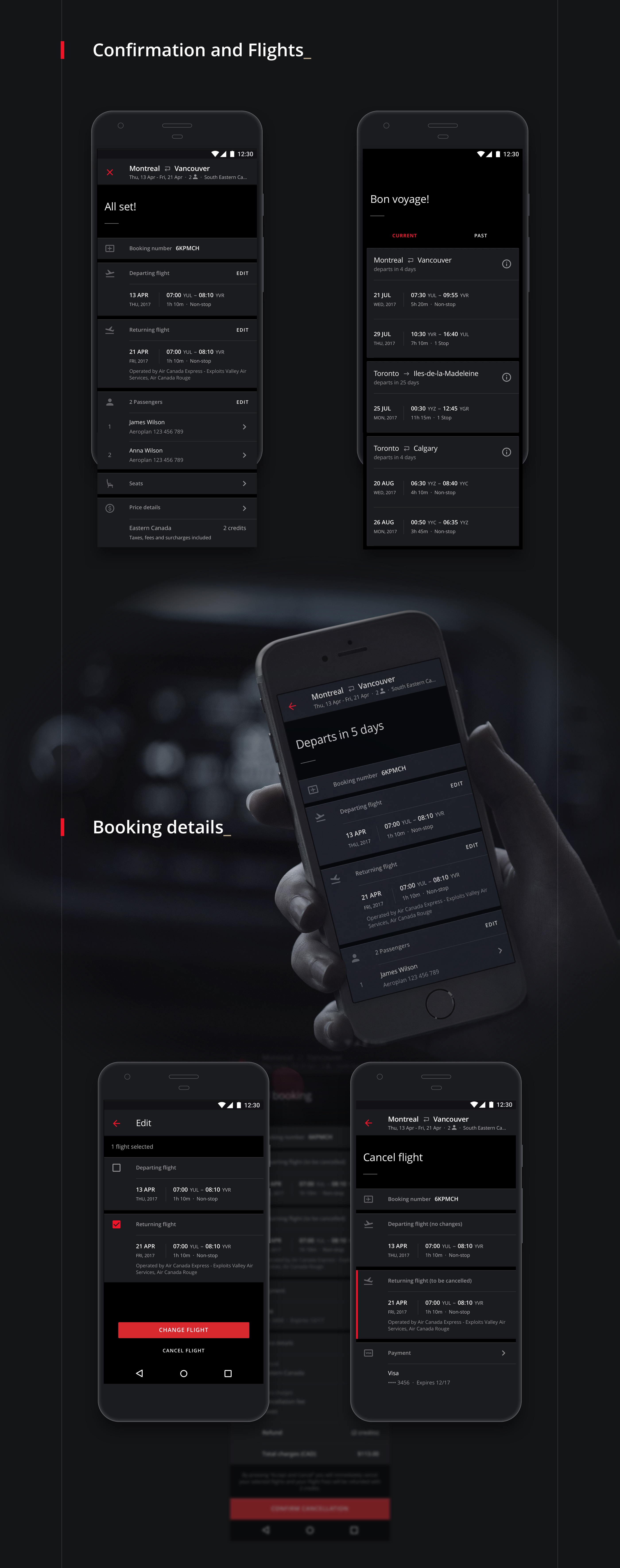
Air Canada is Canada's largest and the world's 14th largest airline, serving more than 29 million passengers yearly, and decided to rethink and improve the booking process, to offer their business customers a modern seamless experience. In my Design Lead role I was responsible for the entire design effort for 2 mobile platforms, iOS and Android, working in team of 12 (engineers, architects, product, QA...) for 3 months in a highly Agile effort to release the new mobile experience.
Approach
My goal was to craft an experience that relied on frequent flyers history and preferences to accelerate the booking process. The parts with the highest business and technical complexity were the alternative scenarios, like the extended booking and seat selection experience. In terms of look and feel, design explorations initially were mainly light UI, however 3-4 weeks in dark UI showed better results in usability tests.
Results
As a result the flight booking task was reduced from 4-6 minutes to 40 seconds on average. Upon release, the app was an immediate success receiving a rating of 4.5 stars on App Store, which paved the way to Air Canada Mobile 3.0 app (development on-going.)
7x
Faster Flight Booking Time
40 seconds on average, down from 4-6 minutes
4.5
App Store Rating
which paved the way to Air Canada Mobile 3.0 App (development on-going)


